18 décembre 2013 10:46, par Amaury Bouchard
Adapt.js serves CSS based on screen width. Other methods include: Build a separate site for mobile. Or, use media queries to adjust layout, with a polyfill for older browser support, and conditional Internet Explorer comments for Windows phones. Also a factor is how to handle multiple image resolutions without adding file size. Filament Group is advocating context aware image sizing.Dernières infos sur le même thème
29 octobre 2017 10:00, par Amaury Bouchard
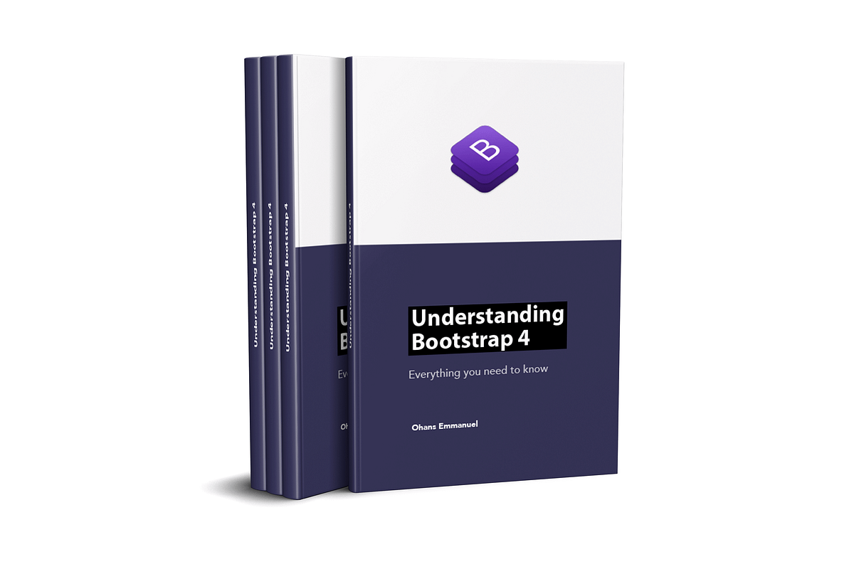 This article will cover the practical fundamentals you need to start building responsive websites with the latest version of Bootstrap, version 4. You may be wondering — why did Ohans write this 17…
06 octobre 2017 21:38, par Amaury Bouchard
 What are the UX design tools you use to create flowcharts? What are the best tools for wireframing, prototyping, user testing, interaction design or team collaboration? There are an overwhelming…
23 août 2017 19:07, par Amaury Bouchard
 Put Google's insights about what makes a great manager to use without paying a penny.
23 mai 2017 14:11, par Amaury Bouchard
 Creating a well-designed site, product, or project usually isn’t cheap. You know you want to make something that looks good–but how do you do it if you’re working with a limited budget? While there’s…
17 mars 2017 14:40, par Amaury Bouchard
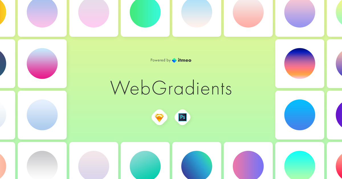 Come to WebGradients.com for 180 beautiful linear gradients in CSS3, Photoshop and Sketch. This collection is curated by top designers and totally free.